Overhauling Wolt's Interfaces

Wolt's refreshed product look marks a new chapter for Wolt in the lives of its customers and signals a growing maturity for the business and the brand: one that is cleaner and more joyful.
Client
Wolt
Service
Digital design system
Role
Designer
Duration
1 year 10 months
Year
2025
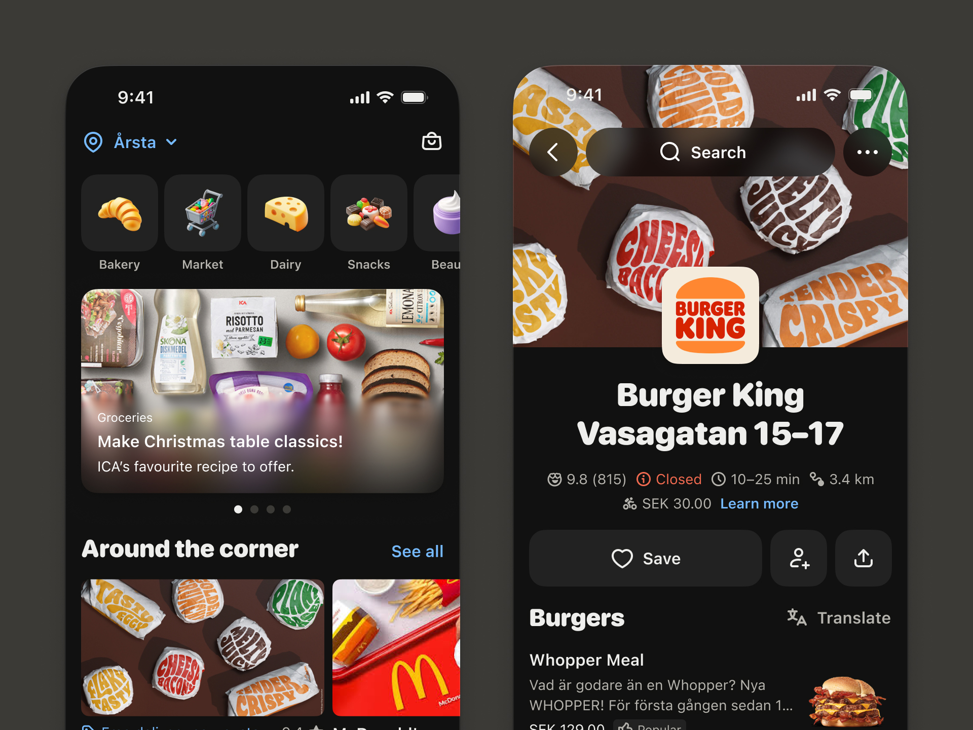
In 2023, Matteo helped launch the initial phase of a unified, multi-platform design system for Wolt. A system focused on fostering connections across every touchpoint. Which meant, systematising colours, typography, iconography, and spacing.

Once Matteo and his team had finished helping elevate Wolt's core product elements to create a distinctive, refreshed identity, they shifted their focus to unifying how the Wolt brand comes to life across product experiences. A strong partnership between design and engineering was the key to driving cohesion across the entire design system.

No items found.
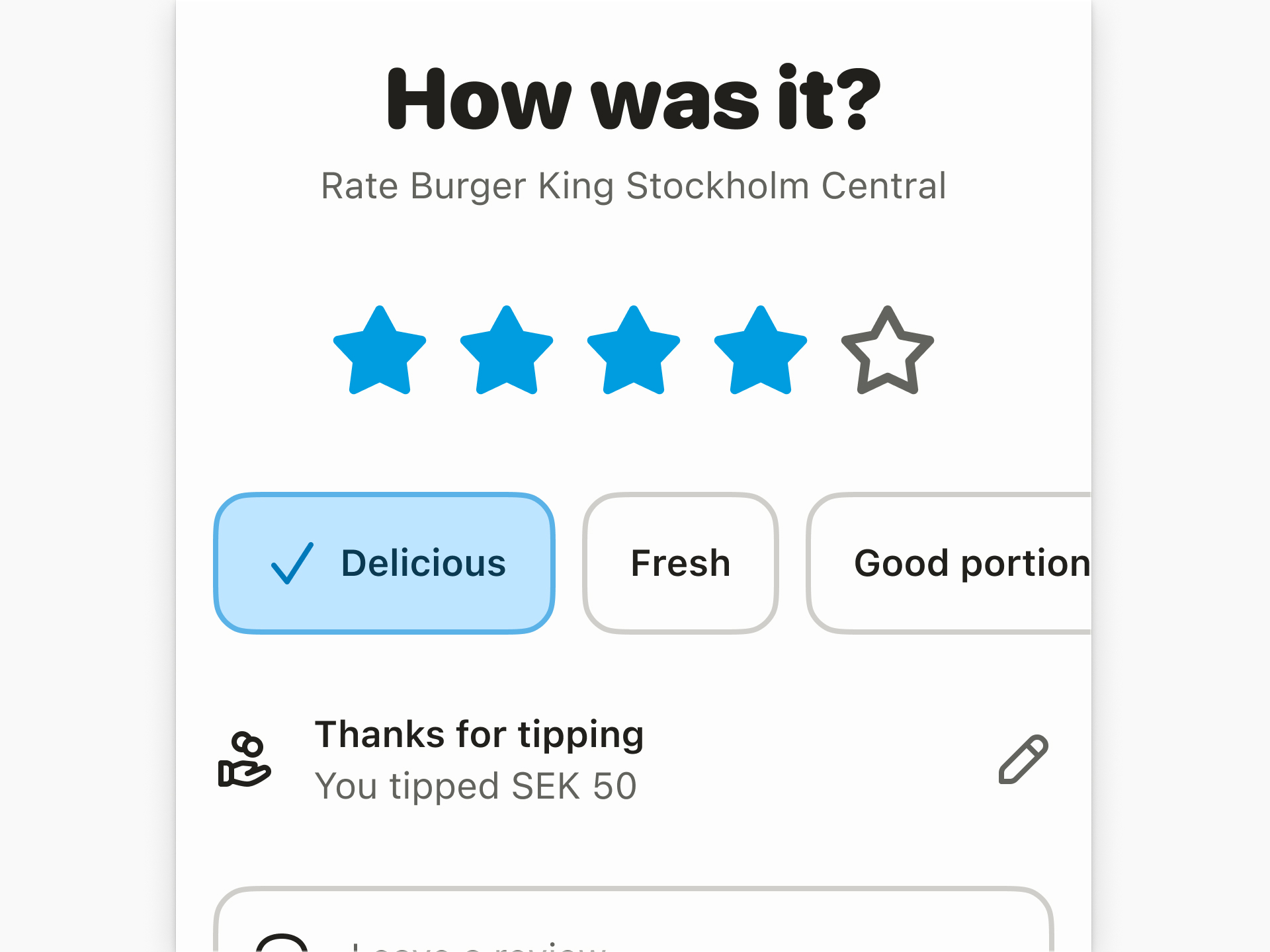
"From functional to expressive, the entire iconography system was redesigned. More than 600 icons."
No items found.
From functional to expressive, the entire iconography system was redesigned, with a strong focus on reactions. More than 600 icons. Reactions were of particular importance, as they are a visual way for users to understand a venue's rating and to express themselves as they review what they try on Wolt.


No items found.
In addition to icons, Matteo and his team developed a tool to generate algorithmically accessible colour palettes, using the OKLCH colour space.


No items found.